Yesterday Peter Kim presented me (and Bob Stroud and Charly Craik) with the Ice Bucket Challenge. Peter and Susan Marqusee were challenged by Terry Oas. This fundraiser holds special significance for all of us because Tom Alber, our friend and my PhD advisor, recently passed away from ALS. I think that Tom would have loved the Ice Bucket Challenge.
Tom was incredibly courageous during the final years of his life. He never stopped learning about the underlying mechanisms of ALS and thinking of potential therapies. It was very painful to see him disappointed again and again by the ineffectiveness of the available treatments. Some of this disappointment is due to general difficulties in developing treatments for neurodegenerative diseases, but some of it was due to our lack of knowledge about the basic mechanisms of this disease.
I challenged Michael Eisen, Ron Vale, and Barb Zunder. Barb will help spread the message to USF. I hope that Ron will take the challenge, donate, and work to invite a top ALS researcher to create an iBioseminar or iBiomagazine video about ALS. There is a real opportunity for iBiology to use their production platform to capture the spirit of the moment. They can produce a fantastic video that describes the challenges and recent successes in understanding basic mechanisms of neurodegenerative disease.
Mike is refusing to accept the challenge to make a larger point about the relationship between funding agencies, research, and public access to research findings. I sympathize with his point. I know that Tom was always up to date on ALS research because of the journal access afforded to him as a professor at UC Berkeley. Other patients do not have this access and that is a shame. I hope that Mike will still donate to The ALS Association or to a lecture established in Tom’s memory at UC Berkeley, or both. In the meantime, here are a few open-access papers on the subject of Amyotrophic lateral sclerosis:
I’ll add more links as people send or comment on them. Fortunately, due to the hard work of people like Mike, many classic papers are now available through Pubmed Central and most journals now deposit articles after an embargo period. In diseases like ALS where it is often only a matter of a few years between diagnosis and death, an embargo of 18 months to protect journal profits seems particular unjust.
We write lots of pymol scripts here in the Fraser lab, and to this end I have written a language grammar to allow highlighting of the pymol syntax in .pml files in Sublime Text (and any other editor that uses textmate style grammars). It should work with just about any basic syntax that you throw at it, though more capability (for things like for loops) will be added as time goes on.
It is publically available for installation through Package Control, which will automatically update with new releases. You can also get it from Github, which will have the most up to date changes between releases (including potential new bugs).
For the curious, I wrote a longer article discussing the details of making the language grammar, and where it currently stands, on my personal website.
I originally wrote this article for my personal website, but I think it is relevant here, so with James’s blessing I am crossposting it.
Python is currently my programming language of choice. It is the programming language taught by my graduate program to incoming first years, and in my experience it is the most common scripting language used by the scientists around me. The Fraser lab uses python almost exclusively for programming.
Because of this, when I want to work with data my first instinct is to go to python. Python is very effective for importing data, doing all of the manipulations necessary, and performing statistical tests. Ultimately, while I am aware that there are a multitude of othertools available, I would rather stick with python.
In my experience, the most painful part of using python for data analysis is visualization. Plotting in python is primarily accomplished via Matplotlib. I find the syntax fairly straightforward, but the default output of the charts leave much to be desired. In particular, I find myself messing with the spacing between the labels and the graph, the size of the labels and title, the linewidth, the colors of the objects, and the visual appearance of the regular tickmarks all to make a single figure look appealing enough to share with my peers. Trying to do this consistently is even more maddening, as it ultimately results in even more boilerplate code.
I ultimately (mostly) solved this problem by creating a matplotlibrc file which automatically imports a number of settings for every chart I choose to work with. My matplotlibrc file lives in a github repository where you can freely grab and modify it. Just put it in your ~/.matplotlib/ folder. I also thought I would use this space to talk about the decisions I made in designing the matplotlibrc to get as close as possible to publication quality images with no special styles in the python code.
Matplotlib’s defaults are unsuitable for any professional purpose
The best way for me to show the problems with the defaults in matplotlib is to show the output of a small snippet of code:
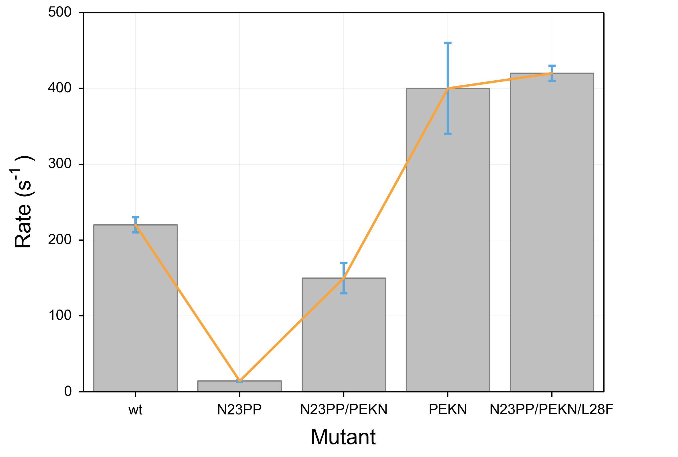
importmatplotlibimportmatplotlib.pyplotaspltdata=[220,14.2,150,400,420]error=[10,1,20,60,10]x=[i+.5foriinrange(5)]fig,ax=plt.subplots()bar=ax.bar(x,data,0.8,align="center",yerr=error)plot=ax.plot(x,data)ax.set_xticks(x)ax.set_xticklabels(('wt','N23PP','N23PP/PEKN','PEKN','N23PP/PEKN/L28F'))ax.set_title(r"Everything in the document can use m$\alpha$th language",y=1.05)ax.set_ylabel(r"Rate (s$^{-1}$)",labelpad=10)ax.set_xlabel("Mutant",labelpad=10)ax.yaxis.set_ticks_position('left')ax.xaxis.set_ticks_position('bottom')plt.savefig('test.png')plt.show()
In this code, I start with two lists, one of y values and one of error values, and proceed to make a named bar chart.
I also throw a line graph on top for illustrative purposes and add some axis labels and a title.
You’ll notice that I actually cheated and did a little bit of formatting in the code: I added padding between the title and axis labels and the graph, and I got rid of the tickmarks on the right and top sides of the graph.
This is because these are not settings that can be affected by the matplotlibrc, so it is unavoidable to include them.
The results for this code are below. It is fraught with problems.
Most obviously, the colors are unpleasant and more importantly unclear.
Because the bar objects and the error bars are the same shade of blue, the lower half of the error bars become invisible.
Furthermore, the line that is overlaid is narrow and a difficult shade of green that is particularly unpleasant when overlaid above the blue of the bars.
The axis labels are also problematic. First, they are too small and as a result difficult to read.
Further, the special formatting (such as use of greek letters and superscripts) uses a distinct font compared to the rest of the text, which makes the labels even more difficult to read.
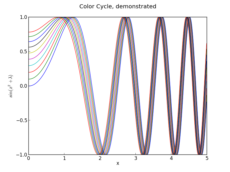
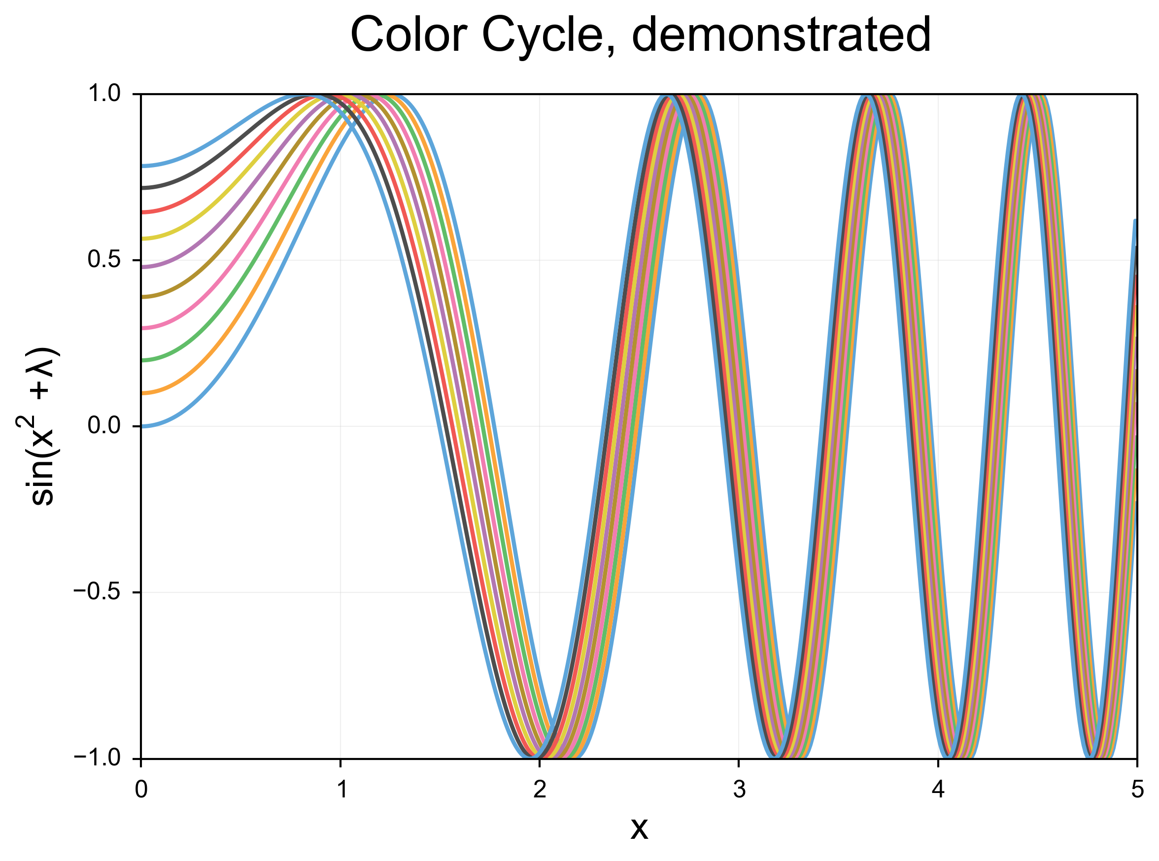
In order to highlight the ugliness of the default color cycle in python, I have attached a second, simpler piece of code and its output:
This code draws a lot of lines which become closer and closer to each other.
The linewidth problem is apparent here, but just as apparent is the inappropriateness of the high-contrast default colors.
Writing a matplotlibrc to fix things
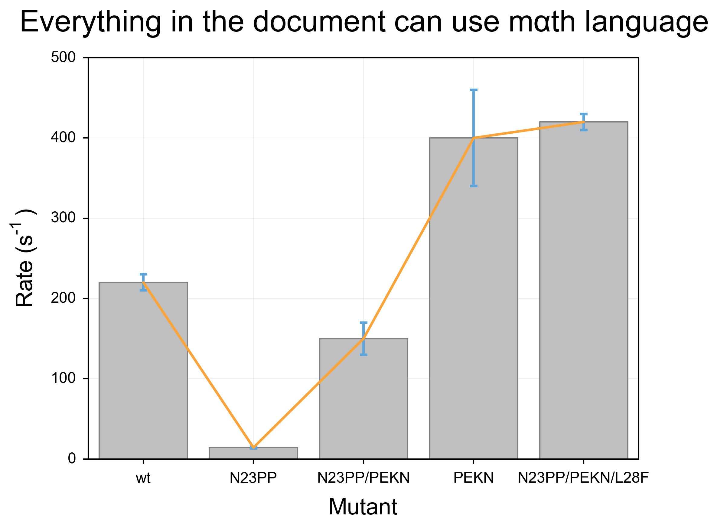
Matplotlibrc files work by adding settings to a text file in the format option_name: option. I made changes to less noticeable things like the backend and the display size and resolution, as well as turning on the “autolayout” option that I find makes much better use of the available space, but in terms of the major problems I discussed above, I made changes in 5 main areas.
Lines
The first thing I did with the lines was to increase the linewidth, so that the lines have a nice weight. Additionally, I turned on anti-aliasing, and introduced rounding at the line edges. In addition to the changes in color detailed below, the effect is quite dramatic. These changes also apply to error bars, and the readability improvement for those is dramatic.
Colors
I introduced a new color cycle, taken from this blog, which in turn took it from Stephen Few’s book “Show Me The Numbers: Designing Tables and Graphs to Enlighten”. This color wheel applies to objects such as lines and error bars. It brings colors much closer to the pastel range, and they sit next to eachother well without creating bad contrast, while still being readily distinguishable. Combined with the improvements to the line shape, the effect is a much clearer, softer line compared to the narrow, harsh colored lines of the default settings.
Shapes
I gave the bars in barcharts and other such shapes a light grey color, which stands out while also allowing other objects such as error bars to be overlaid very clearly. I gave them a thicker, darker grey outline, which gave them a softer gradient than the default black outline. Overall, these objects play very well with the grid, line and error bar overlays, and overlaid text (not shown).
Text
I made significant changes in the font. I immediately increased the font size for the axis labels and the title, to 18 and 24 points respectively. With the increased DPI (discussed above) the effective font size is significantly larger. I also adjusted the font selection to be more math-friendly, so that I could accomplish my second goal: making sure that the mathtext (for things like superscripts) looks identical to the normal font. Right now, Arial is the first preference for fonts, followed by helvetica. Changing to a serif font in the script will continue to use math-friendly fonts. Overall, the text is much more consistent looking and much more clear. Math displayed in the arial font is not as pretty, in my honest opinion, as the defaults, but the continuity with the rest of the text is worth the sacrifice.
Grid and Tickmarks
I turned the tickmarks to face outwards instead of inwards. This has a few effects, including giving clearer marks in particular in busy areas of the graph, as well as placing more spacing between the tick labels and the chart itself. I also further added to the padding between the tickmarks and the tick labels. To extend the tickmarks inwards to the graph itself, I turned on the grid, gave it a very light gray color, and placed it behind all other objects drawn on the chart.
The results
These are the same scripts as above, run with the new matplotlibrc and no other changes. I am very happy with the output, although no doubt I will continue to tweak it as time goes on! I would appreciate feedback as always. Again, like I said above, you can find the matplotlibrc at my github page. Contributions are welcome there as well as in the comments.
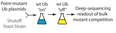
Dan Bolon, a professor at UMass Medical School, has spent the last 5 weeks visiting the lab. He has been helping us set up a deep sequencing project that will form the foundation of the iPQB/CCB Project Lab class this fall. This course, started several years ago by Joe DeRisi, aims to have students work in teams through a project-based curriculum. We have an exciting project planned - and we couldn’t be happier with the results that came out of Dan’s visit. Beyond his steady hands at the bench, we will miss his enthusiasm for the offical lab sport of squash, his journal club paper suggestions, and his rock-solid advice on future research directions. Thanks Dan, please come back soon!
This pdf includes the article and a transcript of the fun discussion that followed Greg Petsko’s presentation, featuring Tom Steitz, Hans Frauenfelder, Johann Deisenhofer, Martin Karpus and others.
A few people have asked me for this paper - because it is hard to find in print and doesn’t seem to be freely available online - so I thought I would post my scan of a hardcopy!